How to use colors in newsletter design?
How can you use colors to stimulate a specific emotion in your readers’ perception?
Let’s take a look at it together as we dig the meaning of color and how you can use different colors in your marketing emails. We’ll give you tips and tricks, inspiration, and useful color examples for marketing emails.
Don’t forget you can easily use INBOXBrush to design your newsletters in minutes!
The Importance Of Colors
When I say red, do you say…?
Love? Passion? Fire? Strength?
Likely something along those lines. Although each individual may sense a color differently, it’s a fact that colors have the capability to initiate a certain feeling or emotion in us, to draw our attention, or give us protection.
The precise meaning of a color is different for each person. It depends especially on things like cultural background, individual preferences, past associations, and context.
In general, these sorts of emotions are associated with different colors.
Marketers have used these insights to brand their products and transmit their messages.
For instance, many organic and sustainable brands use green colors, and hospital staff wear white uniforms. In both cases, we subconsciously expect these colors to appear.
Imagine your doctor welcoming you in a purple uniform, that would probably evoke a different emotion in you.
Although many colors are associated with certain feelings or emotions, you can also associate a color with your own brand. Coca-Cola will always emerge in our minds as red, Snapchat has made yellow its unique color, and the dark green Starbucks logo fits perfectly on your cup of coffee. In these cases, the brand’s identity is much stronger than the importance of the color.
It’s up to you how strongly you believe a color can influence someone’s emotions or encourage a particular move, but there’s a lot to be said about how colors can help your email message and drive readers in the right direction.

When is it a good thought to use colors in emails?
If you ask us, you should consistently use colors! Even in basic text emails, you can use colors to emphasize certain words or a link you like your subscribers to click on.
A tinge of color can grab the receivers’ engagement in a text-based email.
Nevertheless, when you’re designing a newsletter with an email template or starting from scratch, keep the following rules of thumb in mind:
1. Don’t Overuse It
Promising emails have the main call to action, and the format rotates around that call. If your CTA asks readers to click a “See More” button, that button needs to stand out from the others. Therefore, avoid gray, black, or boring colors. Use the most eye-catching and vivid colors. Usually, complementary colors are best for this purpose.
Although using lots of colors in emails may look gorgeous, it may leave the reader not comprehending what to look for. Everything is shouting for their attention, specifically if you use a lot of “loud” colors. Choose your colors wisely so that your message doesn’t lose any effect.
2. Keep It Balanced
Preferably, pick one main color and then add a few supportive colors for your email. At INBOX, the main color is purple. You can also see this in our logo. However, our clickable buttons are blue and white to create contrast and draw the reader’s attention to them.
3. Adjust the Color
Even though we’ve mentioned that everyone’s perception of color is different, we believe that you should adhere to the general sense that colors stimulate.
For instance, the color red often expresses that the message is about urgency or sales. If your email content is promoting a new meditation app, this can cause confusion. Your content would be more effective if the color matches the mood of your message.
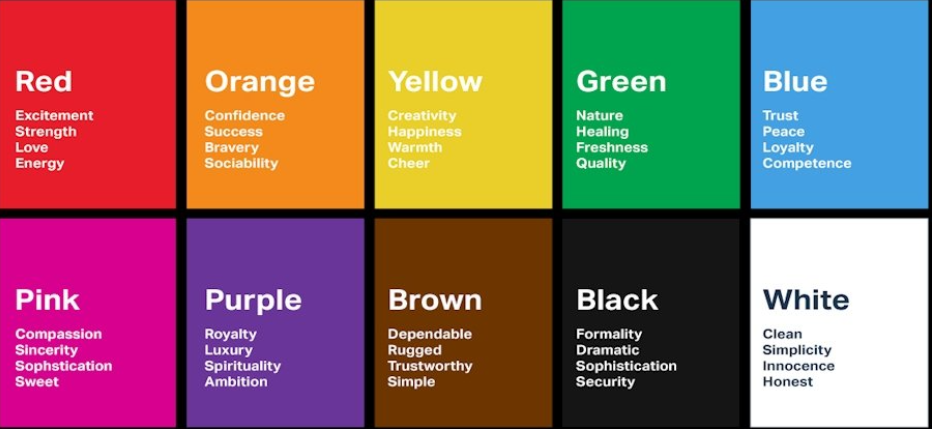
So what color matches the feeling you want to evoke in general?
Use red if you want to express devotion, create urgency, or raise the reader’s awareness.
Use orange when you want to bring warmness, positiveness, and good health.
Use yellow to convey feelings of pleasure, brightness, and cheerfulness.
Use blue when you want to gain confidence and express honesty and commitment.
Use green to convey a sense of calm, nature, prosperity, and balance.
Use white when you want your email to be neutral, peaceful, serene, or tranquil.
Use black sparingly, as this powerful color is associated with strength and control.
Use brand colors in marketing emails
For your newsletters, stick to your brand colors or use a similar color scheme in all your email templates. This way, it’s easier for readers to recognize you as the sender. With every email campaign you send, you strengthen your brand awareness for sure.
Some brands confine themselves to a few marketing colors, while others use an entire color palette or show off colorful images.
How to choose the proper colors?
If you’re not sure what other colors match your brand colors, you can use online color scheme tools to help you figure out which color scheme matches your logo or website.
Here are some online color palette tools you can use:
Adobe Color CC
Paletton
ColorSpace
Many tools work as an interactive color swirl. The best-looking newsletters are created with analog and monochrome color schemes.
Overview
Colors make a considerably huge difference in your newsletter. Certain colors can stimulate different emotions and feelings that you can use to reinforce the message of your newsletter. Keep in mind that each individual may have a different perception of what that color means to them.
Design the layout of your newsletter to match your brand’s color scheme to ensure a consistent look and feel across all marketing channels and to reinforce brand recognition.
In addition, colors are good for catching the reader’s attention and awareness. Use a contrasting color scheme for anything that requires an action, whether it’s a call-to-action button or a link in the text. Now it’s your turn to take your brush and pens!