How to Optimize Your Newsletter Design For Retina Display

What is Retina display?

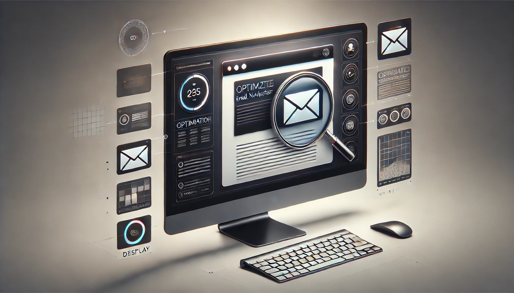
Retina display is an important matter to optimize your email newsletters. To catch up with the current trends and the new technology, you need to learn what Retina screens are and how to create newsletters conforming to their standards. To simply put it, Retina means that the DPI of an image is so high that a ‘normal’ human eye cannot recognize individual pixels. (DPI is the number of pixels on an image; that is basically the dots per inch.) Then, why is the pixel number so important? It is because the higher the pixel we have, the higher clearness and detailed image we get.  Since now almost all the devices use Retina screens or something similar of that nature, it is important to create images (and newsletters) with high number of DPIs.  

A little bit history

The development of Retina Display started with the iPhone 4. Its screen packed in 300 pixels per inch.  This novel development has been regarded as one of the most isgnificant breakthroughs in technology. Since then, Apple has launched several devices with Retina Displays and other companie follwed that suit.  

What is the importance of Retina Display on email marketing?

Email marketing business may seem complex but when you know some trikcs to technologically alter its difficulties, it is not as complex  as it seems. One of the most important, yet relatively unknown one of these points is the Retina Display. In this article, Retina display and its importance for mail marketing is examined and some technical details are shared. Images in your email newsletters should be clear and detailed. Specifically, your images should be compatible on Retina display. If not, the images will appear blurry when switched on on a retina screen device. Something like this: [caption id="attachment_3649" align="alignnone" width="600"] Left: non-Retina image | Right: Retina image[/caption] Obviously, compatibility is a must to catch up with the Retina screens; otherwise, your subscribers might think you are out-of-date and this would downgrade your brand reputation. You may not find it meaningful at all. But think about that; when people get an email from any brand or any sender, firstly, they open it if the title seems interesting. Then, if they open your emails, probably the first thing they will look at is the images. And if your images is clear and detailed enough, they will read the text. The final stage is your goal. Can you imagine that your logo is blurry?  

Retina imges can really improve the visual impact of your emails.


Using Retina images in email newsletters

Roughly speaking, Retina display has as twice as many pixel per inch (DPI) than traditional ones. This means that your images on your emails also need to grow twice as much. Here is how to do it. Let’s start with a simple example: In the below banner that we use in our newsletter, there is a logo of UseINBOX. With HTML coding, the logo is resized to 130x48 pixels. If we save the logo with these sizes, then the subscribers on our email marketing list displaying the newsletter on a Retina screen would see something blurry like this: To optimize the logo for Retina screens, simply resizing the logo to twice a bigger size would be enough. (That is 276x102 pixels) However there is the confusing part in this process. Although we resize our logo to its twice bigger size, what we need to place in the newletter is still the original size (130x48 pixels). What we need to do is to fix it with HTML coding. The below codes works just fine to scale our logo for the newsletter. Eventually, what we get in our newsletter would seem like this on a Retina screen; which is quite perfect:  

Can background images be created as Retina images?

Yes, why not?! Even though its application is a little bit hard, the principles are the same. One single point to draw attention to is that it wouldn’t work on every platform. For Retina background images , we need to use CSS insstead of standard HTML coding. Like we did below: The background is set with CSS’ background features in order not to miss the eccentricities of Gmail and Android clients and that of “shorthand property”  

Some points to consider

Although doubling the size of your images and then scaling them to your newsletter seems ok to fit in the Retina world, there are some shortcomings of this method. Today, more than 60% of emails are opened on mobile devices and with mobile plans. The bigger the size of an image, the more quota it consumes from your mobile plan. Moreover, the bigger the size of your newsletter the longer it takes to be displayed. Therefore, this simple method causes unfriendly user experiences in general. Also, not every email marketing campaign requires you to use Retina images. If you use many images in a newsletter for a campaign; then using non-Retina images would be better idea in order not to create newsletters that takes years to download. You would want to be seen first. Nevertheless, if you must use Retina images in your newsletters there are two methods to avoid big file-sizes: First and the complex one is to use “compressed images”. These are the images with big image sizes but on low quality. Most programmes (including Photoshop) asks you for the image quality before saving. To catch still good quality of an image, save your work with quadrupled image size. Your image would still be displayed great on Retina screens and has a small file size at the same time. The second method is to use special compression programmes to do the same thing. There are tons of free and even online programs that you can use for compressing the file sizes of your images.   Now, try INBOXBrush to create perfect newsletters for your email marketing campaigns. The image editor tool of INBOXBrush will help you optimize your images for Retina screens and create a beautiful newsletter that is compatibl on any device.