Newsletter signup forms are the best way to get new people to your email marketing database. That’s why they should be attractive and easy to access. Whether a full web-page design or a pop-up, any newsletter signup form should be visible to your website visitor and persuade them to receive emails regularly.
Newsletter signup forms are a crucial part of your email marketing campaigns; in fact, this is where the journey starts. With smartly designed forms, you can continually expand your database and reach more potential customers.
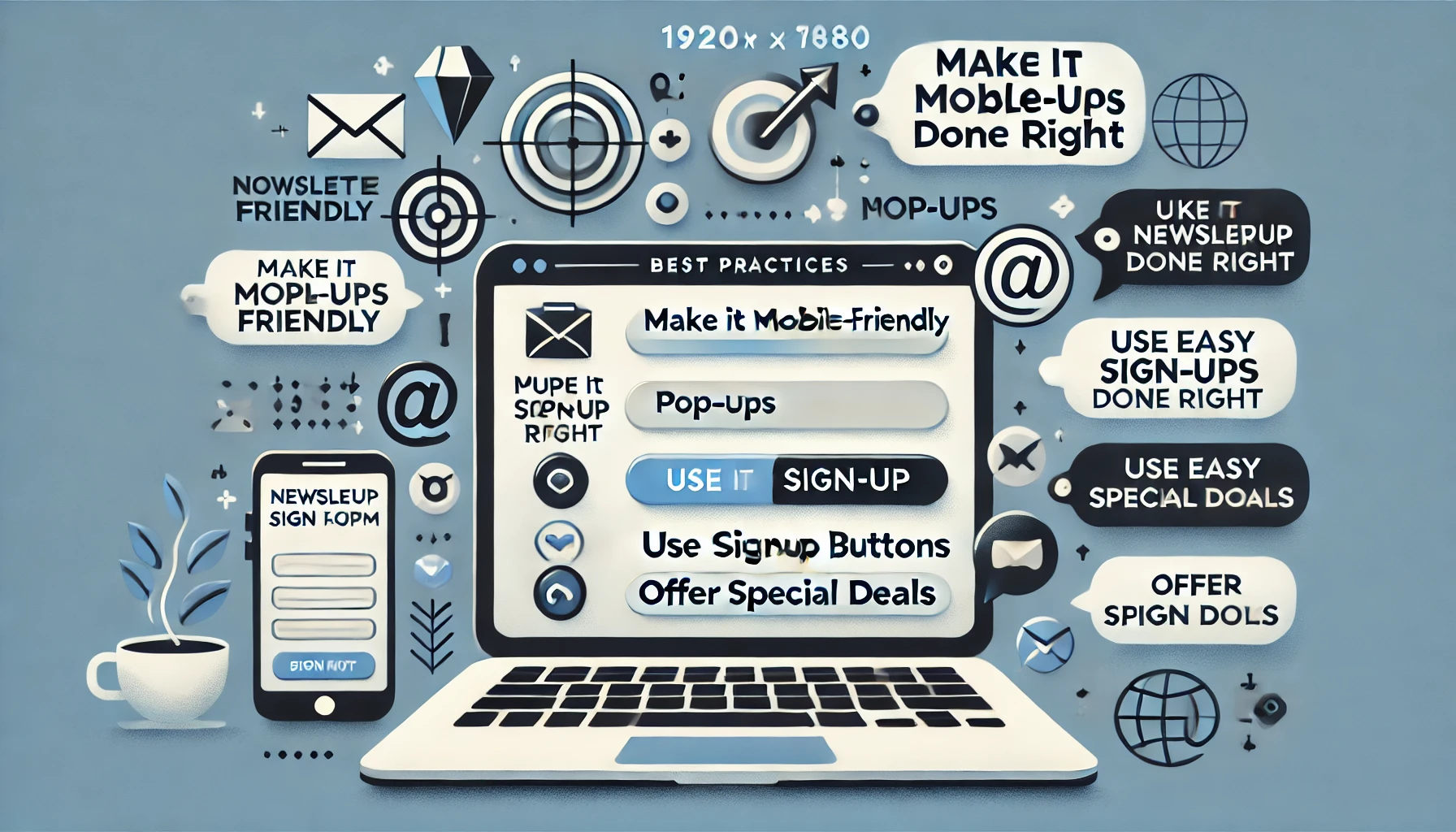
Make it Mobile-Friendly
Since smartphones have flourished, most website traffic is generated via mobile devices. Without a mobile-friendly design, most subscribers would be deterred from the start and likely wouldn’t bother filling out the form.
Responsive designs are the best solution. One key point to note is that the signup form should not require scrolling up and down to be filled out.
Basically, any user will leave the page if the form is difficult to fill out. So, you should work to ensure it is easy to use right from the start.
Pop-ups Are Popular Again
Most people still think that pop-ups are outdated since they often irritate users. But the truth is, pop-up culture has evolved to fit user habits. Users typically want to spend some time on a page before encountering interruptions like pop-ups.
Timing is key: showing a newsletter subscription pop-up at the right time can be very effective. For example, pop-ups may not be ideal for the homepage, but after a visitor has spent some time on a particular page, it may be appropriate to display a pop-up within a few seconds.
This requires an analysis of visitor behavior on your site, and cookies are essential at this point.
One-Column Web Pages Are Trending
Pop-ups and subscription pages are not alternatives to each other—you should use both. While pop-ups are an aggressive marketing method, a stable web page for newsletter signups can capture already interested subscribers.
A one-column web page for subscriptions should prioritize the form and avoid excessive marketing. Keeping the design simple sends a message that your email marketing campaigns will be just as easy to engage with.
One-column pages are also easy to make responsive and look sharp on the screen, allowing for more creativity in the design.
Special Deals and Free Offers Make Subscription Attractive
Everyone loves free stuff or personalized special deals. The digital world allows you to combine data from different channels for better marketing results. Cookies collected from visitors allow you to show subscription pop-ups that offer personalized deals based on visitor interests.
Use Easy Subscription Buttons with Social Media Accounts
Integrating your website with prominent social media platforms helps generate more subscriptions and allows users to fill out forms with a single click.