Email newsletters have evolved far beyond simple text updates or static image layouts. In the digital age, they serve as interactive experiences — combining design, storytelling, and personalization to engage readers on a deeper level. The right newsletter can inspire clicks, strengthen brand loyalty, and even drive direct sales. From interactive carousels and embedded videos to dynamically personalized greetings, the modern newsletter is now an extension of your brand identity.
Designing a newsletter that stands out requires balancing creativity with usability. It’s not just about visuals — it’s about how those visuals support your message and call to action. With platforms like INBOX’s newsletter design tool, you can access drag-and-drop features, automated workflows, and API integrations that make building professional newsletters simple, scalable, and visually impressive — no coding required.
1. List Your Priorities
Think of your newsletter as a carefully structured story — with a beginning, middle, and end. Start by defining your main goal: Do you want to increase traffic, promote a product, share company news, or build community trust? Once you know your goal, every section should serve that purpose.
Your top priorities should always appear above the fold — meaning readers should see them immediately without scrolling. Place your key visuals, promotional highlights, or latest announcements near the top. Supporting content, like customer stories or blog highlights, can follow further down. Maintaining consistent branding with your logo, brand colors, and typography ensures your emails feel cohesive and trustworthy.
Not sure how to start? Explore INBOX newsletter design examples for inspiration on layout sequencing, color balance, and visual hierarchy that guides readers from one section to the next effortlessly.
2. Make Your Design Compatible
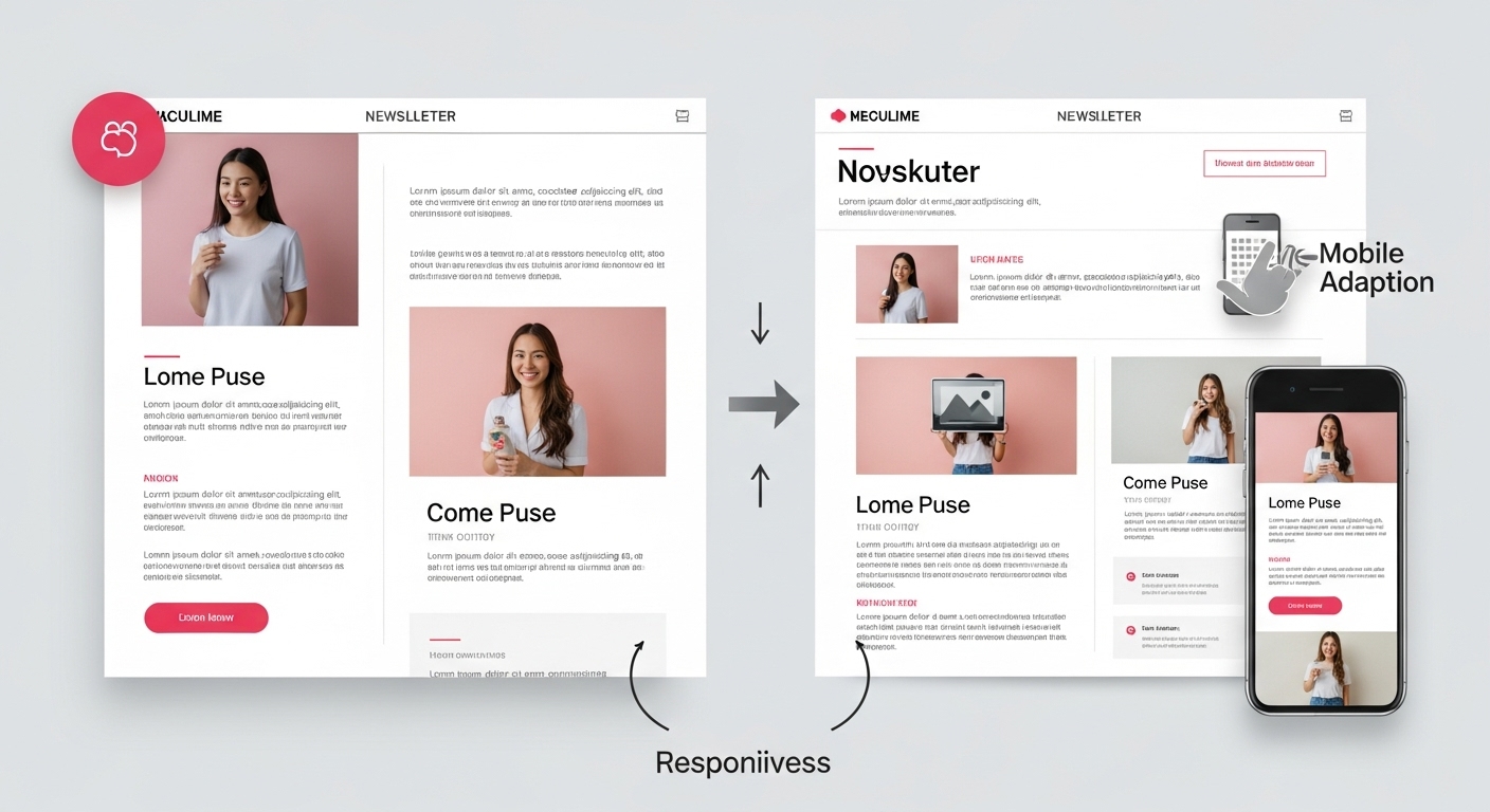
With over 70% of emails now opened on mobile devices, compatibility is no longer optional — it’s essential. A well-designed newsletter should look equally impressive on both desktop and smartphone screens. Limit your structure to one or two columns for optimal mobile responsiveness, and avoid oversized images or long paragraphs that break the layout on smaller screens.
Responsive templates from INBOX automatically adjust text sizes, image scaling, and button placements. You can preview how your email appears across devices before sending — ensuring consistency and eliminating rendering issues. The goal is to make reading effortless and scrolling enjoyable.
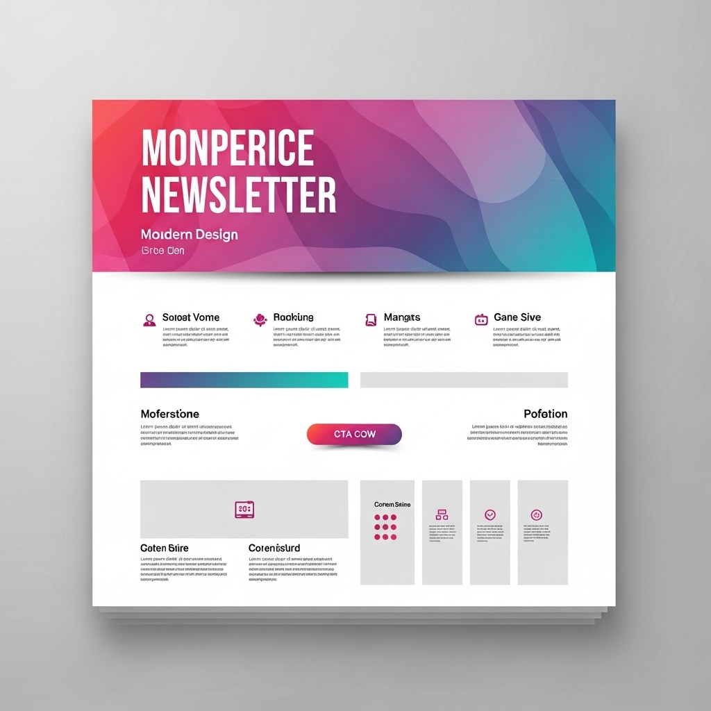
3. Create an Eye-Catching Header
Your header sets the tone for everything that follows. A great header captures attention within seconds and tells the reader what to expect. Use vibrant, brand-aligned colors and creative typography to make your logo and title pop. Adding a subtle call to action (like “Shop Now” or “Read the Latest”) right in the header can immediately guide your audience toward the next step.
Experiment with animated GIF banners, rotating headlines, or seasonal design variations to make your emails feel timely and dynamic. INBOX’s personalization features allow you to tailor headers based on user behavior or demographics — for instance, greeting subscribers by name or highlighting offers relevant to their past purchases.
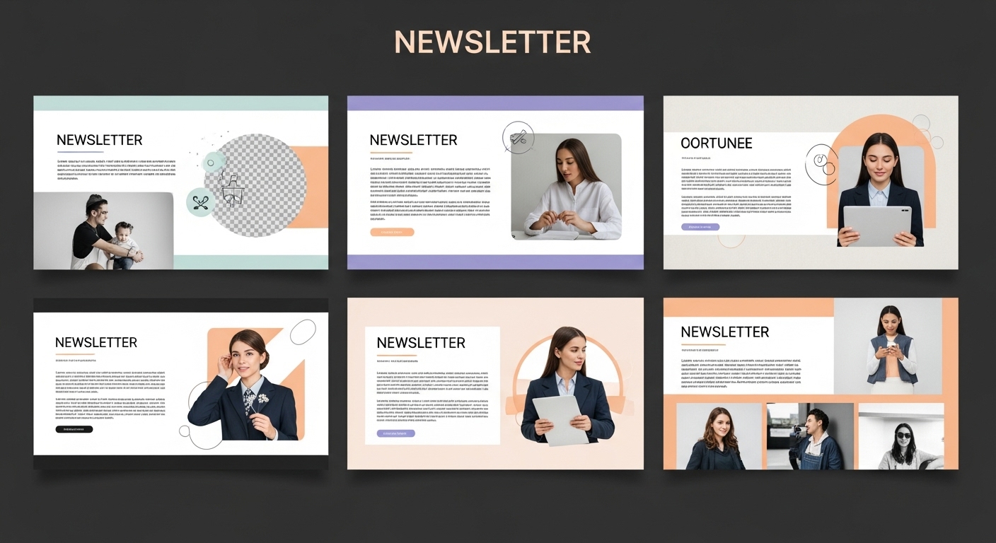
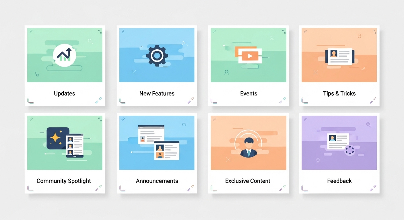
4. Create a Story With Themed Images
Images are one of the most powerful storytelling tools in your newsletter. Rather than inserting random visuals, use themed images that align with your campaign’s tone or season. A consistent visual theme — such as a shared color palette or recurring element — helps build recognition and gives your newsletter a cinematic quality.
For example, if your newsletter series focuses on sustainability, you might use natural tones, plant textures, and eco-conscious imagery across multiple issues. This continuity strengthens your brand narrative. You can browse INBOX landing pages for design inspiration that translates beautifully into email campaigns.
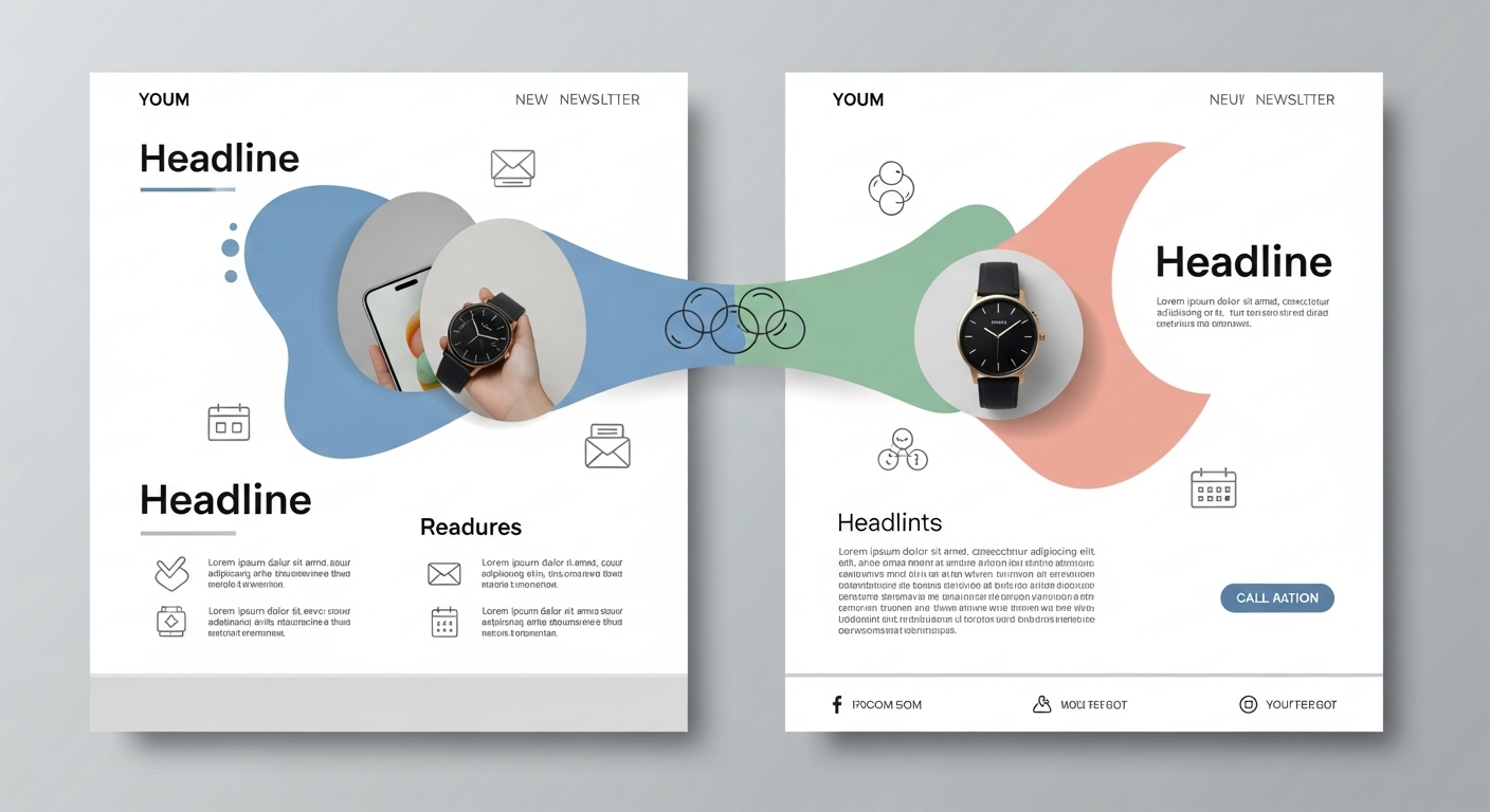
5. Merge Columns for a Unified Design
When working with multi-column layouts, consider breaking the visual grid to create cohesion. Overlapping images or text boxes that extend slightly into another column can add energy and depth. This approach works especially well for showcasing product comparisons, testimonials, or photo collages.
INBOX’s editor makes it simple to merge columns visually while maintaining responsiveness. Use soft shadows, curved dividers, or connecting backgrounds to tie sections together. This not only enhances readability but also creates a smooth, guided visual flow that keeps your audience engaged.
6. Use Colors Strategically
Color is more than decoration — it’s psychology. Each hue evokes an emotional response: blue conveys trust, green implies growth, and orange sparks enthusiasm. Use contrasting colors to highlight buttons or CTAs while keeping your primary color palette consistent with your brand identity.
Subtle gradients and accent highlights can bring depth without overwhelming the reader. If you’re unsure how to start, explore automation-friendly templates from INBOX, which are predesigned with harmonious color combinations and customizable branding options. Proper color strategy enhances readability, draws attention to CTAs, and improves engagement metrics.
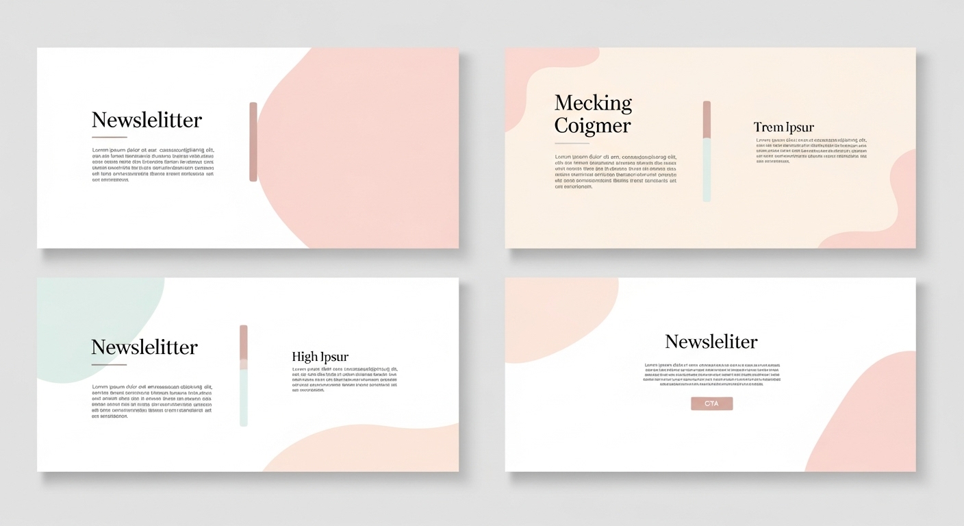
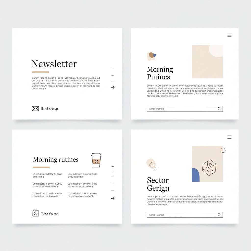
7. Keep It Simple
The average reader spends only about 11 seconds scanning an email before deciding whether to continue. Simplicity ensures your message gets through fast. Use short paragraphs, bullet points, and clear subheadings to make content scannable. Avoid unnecessary graphics or lengthy intros — let every element serve a purpose.
White space is your friend. It creates breathing room and directs the reader’s focus to your main points. Minimalist designs not only look modern but also load faster and perform better on mobile. INBOX’s templates are purposefully built with simplicity in mind, allowing brands to communicate powerfully with fewer words and cleaner layouts.
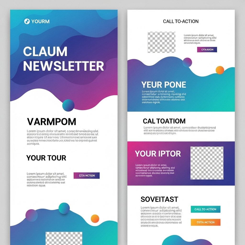
8. Reshape Borders for Visual Interest
Most email designs rely on simple rectangular boxes — but modern newsletters are breaking that convention. Try adding rounded edges, angled dividers, or organic shapes that create a more natural flow between sections. This adds visual rhythm and distinguishes your brand’s design style.
Custom border shapes also guide the reader’s eye strategically from one section to the next. For instance, a curved border leading into a CTA button can subtly encourage action. Explore INBOX form designs and templates that integrate such creative touches effortlessly into responsive layouts.
Conclusion: Modern newsletter design is about storytelling through structure, simplicity, and emotion. When you combine strategic layout choices with compelling visuals and clear CTAs, your emails don’t just inform — they inspire. Whether you’re building awareness, nurturing leads, or showcasing your brand personality, a thoughtfully designed email can make all the difference.
With INBOX, you can easily design newsletters that are not only aesthetically pleasing but also technically optimized for every device. Explore our customer reviews and about us page to learn how businesses worldwide are transforming their communication through stunning, high-converting email designs.
Start Designing Your Newsletter Today!
Sign Up FreeNo risk, no credit card required. Create your first design in minutes.