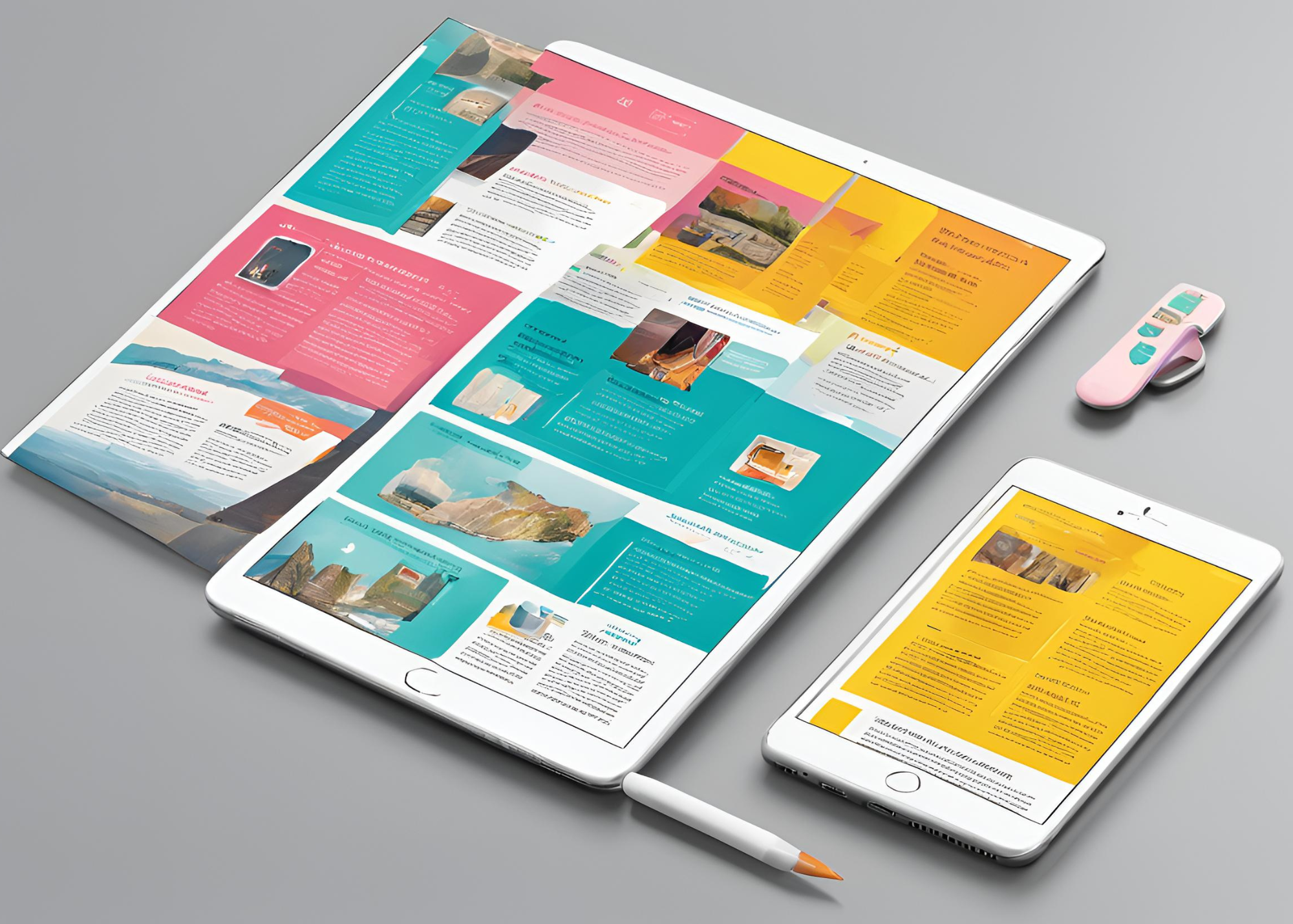
Newsletter design is, without doubt, the most important part of an email marketing campaign. The last few years have presented a challenge for newsletter designers. With the spread of mobile devices globally, it has become harder to create responsive newsletter designs, as screens vary significantly between desktop machines and smartphones. However, as we move further into the mobile era, designers must adapt.
Today, approximately 60% of all emails sent are opened via mobile devices, and this number is growing rapidly. Yet, according to recent research, only half of the designers create newsletters with a “mobile first” approach. As a result, many email campaigns fail to reach their target audience properly due to responsivity issues.
1. Be Responsive, Not Scalable
Responsive design doesn’t mean simply scaling newsletters to fit different screens. It refers to a smart feature where the newsletter optimizes itself based on the device it is opened on. A responsive newsletter generally has two versions: one for desktop and one for mobile. A @media query determines which version to display when the subscriber opens the email.
This type of responsiveness allows designers to adjust almost everything for the two different versions. See our article on email marketing in the mobile era for more tips on mobile optimization.
2. Reverse Your Design Project: Consider “Mobile First”
Many designers create newsletters optimized for desktops as a habitual practice. But times have changed. According to reports, the main version of a newsletter should be the mobile one, as mobile open rates far exceed others.
One key consideration when designing for mobile is to make call-to-action (CTA) buttons as visible and clickable as possible without disrupting the overall design.
3. Don’t Get Drowned in Detail
It’s impossible to create a perfectly responsive design that works flawlessly on every device. So, don’t waste time adjusting every minor detail. Your newsletter will have visible flaws on some devices regardless of your efforts.
There are hundreds of devices with different screen ratios, software, and technology. It’s safe to assume that most of your emails will be opened on Android and Apple devices at a roughly 50/50 ratio.
4. Pay Attention to Technical Details
One key technical aspect is to stick to a one-column layout in the mobile era. A good rule of thumb is to keep designs within 500-600 pixels wide and use a responsive font size, such as 14px, which works well on iPhones. Smaller sizes may display incorrectly on mobile devices.
Check out our article on adjusting newsletters for Retina displays for more tips on improving the quality of your newsletters.
5. Don’t Use a Single Image File as Your Newsletter
A common mistake in email marketing is creating a newsletter in a third-party software, like Photoshop, and then optimizing it using HTML coding. No matter how good a designer is with HTML, a single image will not be optimized for every device. As we discussed earlier, this approach results in a scalable, but not responsive, design.
Instead, your newsletter should contain both images and text elements. If you’re struggling to create responsive designs or don’t have the time, there are plenty of free responsive templates available online, or you can purchase them. You can also use INBOXBrush for responsive newsletters.
